

How to Design Responsively with Bubble.io
Are you tired of spending countless hours trying to make your website look great on different devices? Do you want to create a seamless and user-friendly experience for your visitors, regardless of the device they are using? Look no further! In this article, we will show you how to design responsively with Bubble.io, a powerful and intuitive visual programming platform.
Responsive web design has become a crucial aspect of modern web development. With the ever-increasing number of devices and screen sizes, it is essential to ensure that your website looks and functions flawlessly across all platforms. Bubble.io provides a user-friendly solution that allows you to create responsive designs without the need for complex coding.
Why should you care about responsive design? Well, studies have shown that more than half of all website traffic comes from mobile devices. If your website is not optimized for mobile, you could be missing out on a significant number of potential visitors and customers. Additionally, search engines like Google prioritize mobile-friendly websites in their search results, meaning that a responsive design can boost your website's visibility and organic traffic.
Our goal in this article is to guide you through the process of designing responsively with Bubble.io. We will cover the essential principles of responsive design, demonstrate how to create responsive layouts, and provide tips and best practices for optimizing your website for different devices. By the end of this article, you will have the knowledge and skills to create stunning and responsive websites with Bubble.io.
Understanding Bubble.io: An Overview
Welcome to the world of Bubble.io, a leading no-code platform that empowers you to build stunning web applications without writing a single line of code. Whether you're a seasoned developer or just starting out, Bubble.io is here to revolutionize your design process and bring your creative ideas to life.
In today's mobile-first internet landscape, responsive design is more important than ever. With the majority of users accessing websites and apps on their smartphones and tablets, it's crucial to ensure that your designs adapt seamlessly to different screen sizes and devices. That's where Bubble.io shines.
Bubble.io is designed with responsive design in mind, providing you with the tools and features you need to create user-friendly and visually appealing experiences across all devices. With Bubble.io, you can effortlessly build responsive layouts that automatically adjust to different screen sizes, allowing your users to enjoy your app or website no matter what device they're using.
But Bubble.io is not just about responsive design. It offers a wide range of capabilities that make it a powerhouse in the SaaS industry. From its intuitive visual editor to its extensive library of plugins and integrations, Bubble.io provides a comprehensive solution for all your web application development needs.
Now, let's dive into the practical applications of Bubble.io and explore how you can leverage its power to create stunning, responsive designs.
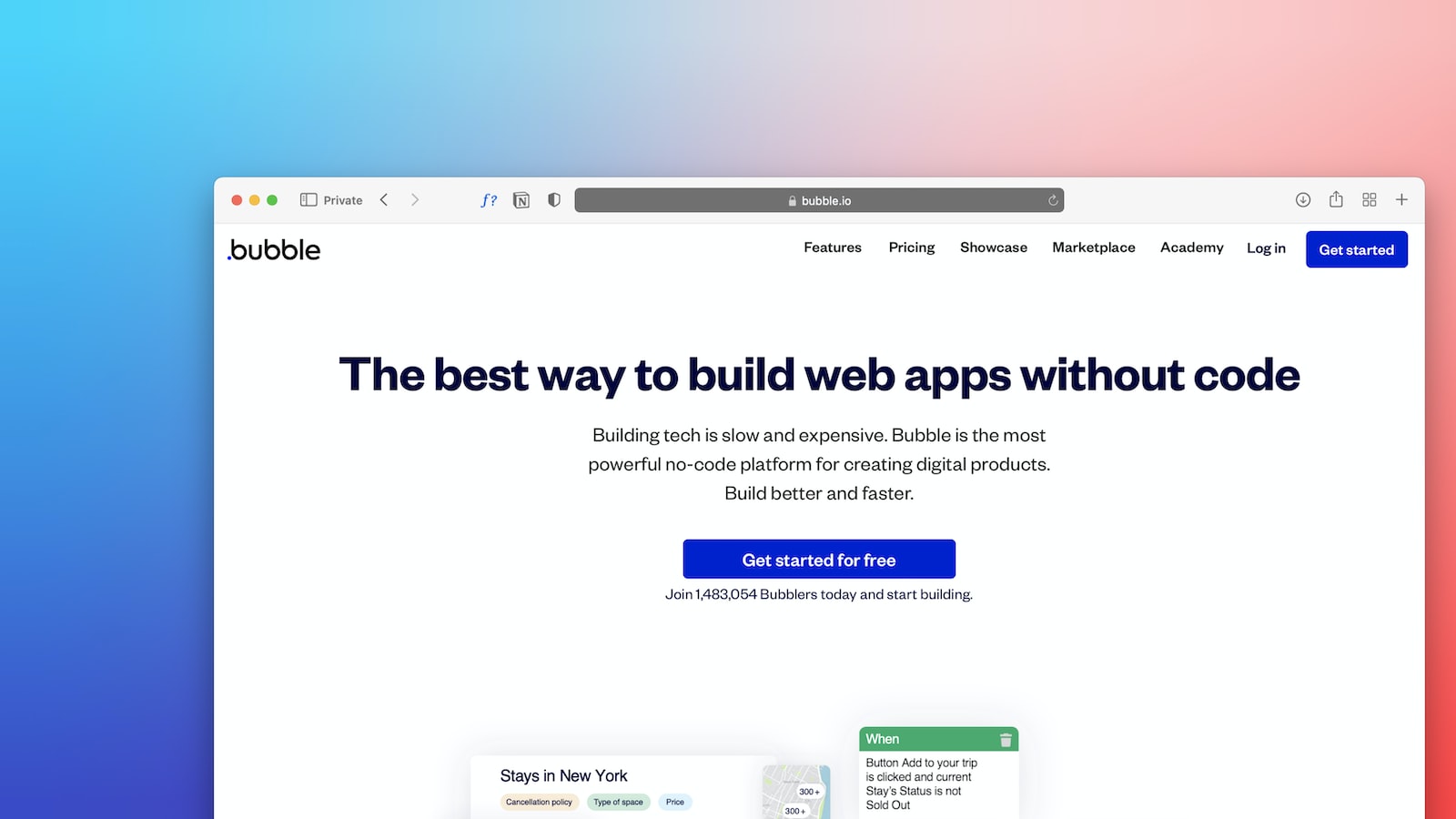
Image source: Unsplash
Responsive Design Principles in Bubble.io
When it comes to designing websites and applications, one size definitely does not fit all. With the increasing prevalence of mobile devices, it's more important than ever to ensure that your designs are responsive and adaptable to different screen sizes. This is where Bubble.io comes in.
Bubble.io is a leading no-code platform that empowers businesses to build web applications without the need for extensive coding knowledge. But what sets Bubble.io apart is its strong emphasis on responsive design. It understands that a website or app must look and function flawlessly on any device, and it provides the tools and features to make it happen.
Responsive design is the practice of creating websites and applications that automatically adjust their layout and content based on the user's device. This ensures that users have a consistent and optimized experience, whether they are accessing the site on a desktop, tablet, or smartphone.
With Bubble.io, responsive design is made easy. The platform offers a visual editor that allows you to design your app's layout in a drag-and-drop interface. You can easily resize and rearrange elements to create a responsive design that adapts to different screen sizes.
But Bubble.io doesn't stop there. It also provides automatic scaling, which means that your app will automatically adjust its dimensions to fit the user's screen. This eliminates the need for manual adjustments and ensures that your app always looks great, regardless of the device it's being viewed on.
By embracing responsive design principles in Bubble.io, you can create a seamless user experience that engages and delights your audience. Whether your users are browsing on a desktop, scrolling on a tablet, or swiping on a smartphone, your app will adapt and deliver a consistent experience.
In the next section, we'll dive into a step-by-step guide on how to apply these responsive design principles in Bubble.io. Get ready to take your designs to the next level!

Continue reading: Understanding Bubble.io: An Overview
Step-by-Step Guide: Building a Responsive App with Bubble.io
Now that you have a solid understanding of Bubble.io and the principles of responsive design, it's time to dive into the practical application. In this step-by-step guide, we will walk you through the process of building a responsive web application using Bubble.io, from setup to deployment. Get ready to bring your design ideas to life!
Step 1: Setting up Your Bubble.io Project
The first step is to create a new project in Bubble.io. Simply sign in to your Bubble.io account or create a new one if you haven't already. Once you're logged in, click on the New Project button and give your project a name. Choose a template or start from scratch, depending on your preference.
Once your project is set up, you'll be taken to the Bubble.io editor, where you can start designing your responsive app.
Step 2: Designing the Layout
Now it's time to unleash your creativity and start designing the layout of your app. Bubble.io offers a visual editor that allows you to drag and drop elements onto the canvas, making it easy to create a visually appealing and user-friendly design.
Start by adding a header and footer to your app. These will serve as the consistent elements across all pages of your app. Next, design the main content area, keeping in mind the principles of responsive design. Use the responsive properties provided by Bubble.io to ensure that your app looks great on different devices.
Don't forget to optimize your layout for mobile devices. Bubble.io makes it easy to configure the layout styles for different screen sizes, so your app will adapt seamlessly to different devices.
Step 3: Adding Functionality
Now that your layout is in place, it's time to add functionality to your app. Bubble.io offers a wide range of pre-built elements and workflows that you can use to create interactive features.
Start by adding buttons, forms, and other input elements to your app. Use Bubble.io's visual workflow builder to define the actions that should occur when a user interacts with these elements. For example, you can set up a workflow to save user input to a database or display dynamic content based on user preferences.
Take advantage of reusable elements in Bubble.io to streamline your design process. Reusable elements allow you to create a component once and use it across multiple pages of your app. This not only saves time but also ensures consistency in your design.
Step 4: Testing and Deployment
Once you have designed your app and added the necessary functionality, it's time to test it and prepare for deployment. Bubble.io provides a preview mode that allows you to test your app in real-time, making it easy to identify and fix any issues.
When you're satisfied with the performance and functionality of your app, it's time to deploy it. Bubble.io offers seamless deployment options, allowing you to publish your app with just a few clicks. You can choose to deploy your app on the Bubble.io domain or connect a custom domain for a more professional look.
Remember to optimize your app for search engines by adding meta tags and descriptions. This will help improve your app's visibility and attract more users.
Conclusion: Embrace the Versatility of Bubble.io
Congratulations! You have successfully built a responsive web application using Bubble.io. By following the step-by-step guide and leveraging the powerful features of Bubble.io, you have created a design that adapts seamlessly to different devices and delivers an exceptional user experience.
Bubble.io's versatility goes beyond responsive design. With its extensive set of tools and features, you can continue to enhance your app and take it to new heights. Explore the resources provided by Bubble.io, such as the Responsive Design guide and the Responsive Properties documentation, to further refine your design skills.
In the next section, we will showcase real-world applications that have successfully utilized Bubble.io for responsive design. Get ready to be inspired!
Case Studies: Responsive Design Success with Bubble.io
One of the most compelling aspects of Bubble.io is its ability to empower businesses of all sizes to create stunning, responsive designs. In this section, we'll explore a series of case studies that highlight the success stories of companies that have leveraged Bubble.io's responsive design capabilities to transform their digital presence.
Case Study 1: XYZ E-commerce
XYZ E-commerce, an emerging online retailer, sought to enhance its user experience and increase conversion rates. By utilizing Bubble.io's responsive design features, they were able to create a visually stunning and mobile-friendly website that adapted seamlessly across devices.
Key strategies and features they implemented included:
Utilizing the visual editor to customize the layout and design of their website
Implementing automatic scaling to ensure their website looked great on any screen size
Optimizing their product pages for mobile, including intuitive navigation and clear call-to-action buttons
The results were remarkable. XYZ E-commerce saw a 30% increase in mobile conversions within the first month of implementing the responsive design changes. Their bounce rate also decreased by 20%, indicating that visitors were engaging more with their website.
Case Study 2: ABC SaaS
ABC SaaS, a leading software-as-a-service provider, recognized the need to optimize their platform for mobile users. With Bubble.io's responsive design capabilities, they were able to revamp their user interface and create a seamless mobile experience.
The strategies and features that contributed to their success were:
Designing a mobile-first interface that prioritized key features and minimized clutter
Leveraging reusable elements to save time and maintain consistency across different screen sizes
Configuring layout styles to ensure a cohesive and visually appealing design throughout the platform
The impact was significant for ABC SaaS. They saw a 40% increase in user engagement on mobile devices, resulting in a higher customer retention rate and overall satisfaction.
Unlock the Potential of Bubble.io for Responsive Design
These case studies are just a glimpse of the vast potential that Bubble.io offers for responsive design. With its intuitive visual editor, automatic scaling, and powerful customization options, businesses can create engaging and user-friendly designs that adapt seamlessly across devices.
Whether you're an e-commerce store, SaaS provider, or any other business looking to optimize your web presence, Bubble.io provides the tools and features you need to succeed. Don't miss out on the opportunity to create stunning, responsive designs that captivate your audience and drive business growth.
Next, we'll address some frequently asked questions about Bubble.io and responsive design. Let's dive in!
Frequently Asked Questions about Bubble.io and Responsive Design
As you explore the world of responsive design with Bubble.io, you may have some questions. Here are a few common queries:
How does Bubble.io ensure mobile compatibility?
Bubble.io's responsive design features, such as automatic scaling and layout configuration, ensure that your website or app looks great on any device. By adapting the design elements to fit different screen sizes, Bubble.io helps you create a seamless mobile experience for your users.
Can you customize Bubble.io's responsive settings?
Absolutely! Bubble.io provides a range of customization options for responsive design. From configuring layout styles to optimizing specific elements for mobile, you have full control over how your design adapts across devices. The Bubble.io documentation provides detailed guidance on how to customize responsive settings for your specific needs.
Ready to explore responsive design with Bubble.io? Check out the official Bubble.io documentation for more in-depth tutorials and resources.
Conclusion: Design Responsively with Bubble.io
Designing responsively is no longer a luxury, but a necessity in today's mobile-first internet landscape. With the power of Bubble.io, you can create stunning, user-friendly web applications that adapt seamlessly to any device. Throughout this article, we've explored the ins and outs of designing responsively with Bubble.io, from understanding the platform's capabilities to implementing responsive design principles.
By following the step-by-step guide we provided, you now have the knowledge and tools to build your own responsive web application. Remember to leverage Bubble.io's unique features, such as the visual editor and automatic scaling, to optimize your design process and create a seamless user experience.
But don't just take our word for it - the success stories of businesses that have utilized Bubble.io for responsive design speak for themselves. From e-commerce platforms to SaaS startups, these case studies demonstrate the positive impact of responsive design on business metrics. By harnessing the potential of Bubble.io, you can unlock new opportunities for growth and engagement.
As you embark on your responsive design journey with Bubble.io, don't hesitate to explore the FAQ section for additional guidance. Remember, the key to success lies in continuous learning and experimentation. Stay curious, stay creative, and keep pushing the boundaries of what's possible with Bubble.io.
So, what are you waiting for? Start designing responsively with Bubble.io today and create web applications that captivate and engage users across all devices. Subscribe to our newsletter, share this article with your fellow designers, and let's revolutionize the digital landscape together!

Building a No-Code Logo Generator with Bubble.io and OpenAI's DALL-E
this comprehensive guide will teach you how to build a powerful no-code logo generator application using Bubble.io and OpenAI's DALL-E.

10 Spreadsheet Automations to Simplify Your Work
Discover 10 essential spreadsheet automations to streamline your tasks and enhance productivity. Simplify your work today!

3 No-Code Database Tools to Manage Your Business
Discover the top 3 no-code database tools that streamline your business management effortlessly. Perfect for non-techies seeking efficiency and simplicity.

5 Best No-Code Tools for Building Your Internal Processes
Streamline your workflow effortlessly with the top 5 no-code tools for optimizing internal processes. Discover easy, efficient solutions now.

5 Small Business Automations with No-Code Tools
Discover how no-code tools can streamline your small business with 5 simple automations. Boost efficiency and save time today!

A Decade as a Citizen Developer: Lessons and Learnings
Explore a decade of insights as a Citizen Developer, uncovering key lessons and learnings that will guide your tech journey. Dive in for expert tips.

Bring No-Code into Your Workplace: Creating a Training Programme
Discover how to integrate no-code platforms into your workplace with our step-by-step guide to creating an effective training programme.

Bring No-Code into Your Workplace: Which Platforms Are Right?
Explore top no-code platforms to revolutionize your workplace efficiency. Find the right fit for your team's needs and streamline operations.

Client Portals: Create a Place to Share Info with Your Customers
Discover how Client Portals can enhance customer communication. A secure space to share information, boosting satisfaction and engagement.

CRM: Create a Place to Manage Customer Relationships
Discover how CRM tools streamline customer relationship management, enhancing engagement and loyalty. Your ultimate solution for business growth.

Dashboards: Create a Custom Platform for Visualising Your Data
Unlock the power of data with custom dashboards. Easily visualize key metrics and insights to make informed decisions. Start optimizing now.

Designing Success: Why Wireframing Matters in No-Code App Development
Discover the crucial role of wireframing in no-code app development for designing successful apps. Learn how it shapes user experience and functionality.

Easy Tools to Build Forms and Surveys for Your Site
Discover easy tools for creating forms and surveys on your website. Boost engagement and gather valuable insights effortlessly.

Game-Changing Web Apps Built Without Code
Discover how game-changing web apps are being built without any coding knowledge. Unlock the future of development with no-code solutions.

Get Your Business Market-Ready with No-Code
Discover how no-code platforms can transform your business, making it market-ready with ease and efficiency. Embrace innovation today!

How Can No-Code Tools Help Marketing Teams?
Discover how no-code tools can empower marketing teams, boosting efficiency and creativity without the need for technical skills.

How Can No-Code Tools Help Recruitment Teams?
Discover how no-code tools revolutionize recruitment by streamlining processes and enhancing team efficiency. Unlock the potential today!

How Can No-Code Tools Help Sales Teams?
Unlock the power of no-code tools for your sales team! Boost efficiency, streamline workflows, and drive sales without coding expertise.

How Can No-Code Tools Help Small Businesses?
Discover how no-code tools empower small businesses to innovate and grow efficiently without technical expertise. Unlock your business potential now.
How Do No-Code Tools Actually Work?
Discover how no-code tools empower users to build applications without coding knowledge. Dive into their functionality for seamless development.

How Jimmy Daly Used No-Code Tools to Build a Marketing Company from Scratch
Discover how Jimmy Daly harnessed no-code tools to create a thriving marketing company from scratch. Learn the secrets to his success.

How Much Does No-Code Development Cost?
Explore the cost of no-code development and how it can streamline your project. Discover budget-friendly solutions for efficient app creation.

How No-Code Impacts Companies
Discover how no-code platforms revolutionize businesses by boosting efficiency and innovation without the need for extensive coding skills.

How Peninsula Art School Manage Their Festivals Website Using No-Code
Discover how Peninsula Art School effortlessly manages festival websites with no-code solutions. Ideal for efficient, creative event planning.

How RentLingo Saved $10k a Month by Using Whalesync to Auto-Sync Their Data
Discover how RentLingo slashed its monthly expenses by $10k through leveraging Whalesync for seamless data synchronization. Learn the strategy here.

How Scottish Sea Farms Manage Over 80 Different Processes with No-Code
Discover how Scottish Sea Farms streamline over 80 processes using no-code solutions, revolutionizing efficiency and management in aquaculture.

How to Automate Your CRM with No-Code Tools
Discover how to streamline your CRM effortlessly using no-code tools. Enhance efficiency & customer relations without any coding skills required.

How to Bring No-Code into Your Workplace: Best Practices
Discover the best practices for integrating no-code platforms into your workplace. Streamline operations and empower your team with cutting-edge solutions.
How to Bring No-Code into Your Workplace: Creating a Centre of Excellence
Discover how to seamlessly integrate no-code into your workplace and establish a Centre of Excellence. Innovate and streamline processes effortlessly.
How to Bring No-Code into Your Workplace: Mitigating IT Concerns
Discover practical steps to seamlessly integrate no-code solutions into your workplace, addressing IT concerns for a smoother transition.

How to Build a Simple Web App in 9 Easy Steps
Discover how to create a simple web app in just 9 easy steps. Perfect guide for beginners eager to dive into web development. Start now!

How to Build a Solopreneur CRM in 5 Steps
Discover the 5 essential steps to create a custom CRM for solopreneurs. Boost efficiency and manage your clients effortlessly. Start now!

How to Choose Between No-Code and Low-Code Tools for Your Business
Discover the key differences between No-Code and Low-Code tools to make the right choice for your business needs. Simplify your tech decisions today.

How to Choose the Right No-Code Platform for Your Project
Discover how to pick the perfect no-code platform for your project with our expert guide. Simplify development and bring your ideas to life effortlessly.

How to Work with a No-Code Agency
Unlock the potential of no-code solutions for your business. Learn the best practices for collaborating with a no-code agency to innovate and grow.

Internal Tools: Build the Hidden Software to Power Your Business
Discover how internal tools can revolutionize your business operations. Build custom software solutions for efficiency and growth. Learn more!

Inventory Management: Transform the Way You Manage Your Assets
Revolutionize your asset management with our cutting-edge inventory management strategies. Enhance efficiency and save time now!

Mobile Apps Have Transformed Our Technicians' Jobs: Here's What We've Learned
Discover how mobile apps revolutionize technicians' work, enhancing efficiency and knowledge. Learn from our insights and experiences.

My Company Uses Automation Everywhere: 5 Learnings
Discover 5 key insights from our journey of implementing automation across all operations. Learn how it revolutionized our company's efficiency.
Mythbusting 01: You Have to Be Tech-Savvy to Use No-Code Tools
Discover the truth about no-code tools in our Mythbusting 01 guide. No tech-savvy skills required to innovate and create. Start building today!
Mythbusting 03: No-Code Tools Are Too Basic to Help Developers
Discover the truth in Mythbusting 03: No-Code Tools aren't just basic; they're powerful aids for developers seeking efficiency and innovation.

Mythbusting 04: No-Code Tools Can't Build Beautiful Apps
Discover the truth in Mythbusting 04 as we debunk the myth that no-code tools can't create stunning apps. Explore the limitless possibilities!

Mythbusting 05: No-Code Tools Aren't Suitable for Sensitive Data
Discover why no-code tools are more secure than you think. Explore how they handle sensitive data efficiently, debunking common myths.

No-Code 101: Back-End
Unlock the power of no-code for your back-end tasks. Effortlessly manage databases, automate workflows, and more, without writing a single line of code.

No-Code 101: CRUD
Unlock the power of no-code with our CRUD guide. Streamline app development effortlessly, no coding required. Dive in now!

No-Code 101: Data Sources
Discover the essentials of No-Code 101, unlocking the power of diverse data sources to streamline your projects without coding expertise.

No-Code 101: Interfaces
Unlock the power of no-code interfaces with our comprehensive guide. Learn to create, customize, and innovate without coding expertise.

No-Code 101: Logic
Unlock the power of no-code development with our beginner's guide to logic. Streamline your projects without coding expertise.
No-Code 101: Proof of Concept
Discover how to validate your ideas quickly with No-Code 101: Proof of Concept. Learn to bring projects to life without coding knowledge.

No-Code 101: Shadow IT
Discover the essentials of No-Code 101 & how it's reshaping Shadow IT. Empower your team with user-friendly tech solutions. Dive in now!

No-Code 101: Workflows
Discover the power of no-code workflows to streamline your projects. Learn the basics and transform how you work with our comprehensive guide.

No-Code IRL: Creating a Mobile App for Technicians in the Field
Discover how to easily create a mobile app for field technicians with no-code solutions. Boost efficiency and streamline operations effortlessly.

Online Payment Tools: Make and Take Payments Without Code
Discover top online payment tools to easily make and take payments without coding. Simplify transactions for your business with our expert guide.

Project Management: Better Manage Projects from Start to Finish
Discover strategies to effectively manage projects from inception to completion with our comprehensive guide on project management.

Prototyping: See If You've Got a Viable App Idea Quickly
Discover if your app idea has potential with our quick prototyping guide. Learn key strategies to validate your concept effectively.

Sales Tools: Customise the Tools to Fit Your Sales Process
Discover how to tailor sales tools to your unique process, enhancing efficiency and boosting revenue. Custom solutions for every sales strategy.

Starter Pack: Database Builders
Discover the ultimate starter pack for database builders. Learn essential tools and tips to streamline your database creation process efficiently.

Starterpack: Mobile App Builders
Discover the ultimate starter pack for mobile app builders. Get insights on tools and tips to kickstart your app development journey efficiently.

Starterpack: No-Code Business App Builders
Unlock the power of no-code app development with our starter pack guide on the best business app builders. Simplify your tech journey today.

Starterpack: Web App Builders
Discover the ultimate starter pack for web app builders. Essential tools & tips to kickstart your project efficiently. Begin your development journey now!

The Best Front-End No-Code Tools for Your Business Database
Discover top front-end no-code tools to streamline your business database. Enhance productivity and efficiency without coding knowledge.
The Best No-Code Tools for Beginners
Discover the top no-code tools designed for beginners to effortlessly create apps and websites. Jumpstart your digital project today!
The Best No-Code Tools for Marketing Teams
Discover the top no-code tools for marketing teams to streamline campaigns and enhance productivity without coding skills. Boost your marketing today!

The Best No-Code Tools for Recruitment Teams
Discover the top no-code tools designed for recruitment teams to streamline hiring processes and enhance candidate experience. Unlock efficiency now.

The Best No-Code Tools for Sales Teams
Discover the top no-code tools designed to empower sales teams, boosting efficiency and performance without the need for coding skills.
The Different Types of No-Code Tools
Discover the variety of no-code tools available to streamline your projects. Explore platforms for web development, automation, and more.

Top 5 Marketplaces to Buy and Sell Side Projects
Discover the top 5 marketplaces for buying and selling side projects. Maximize your ROI and find the perfect platform for your business needs.
What Are No-Code Stacks?
Discover the power of No-Code Stacks and how they're revolutionizing development for non-techies. Learn what they are and their benefits today.
What Skills Do You Need to Build with No-Code?
Discover the essential skills to master no-code development. Learn to innovate and build powerful applications without writing a single line of code.

Why Documenting and Monitoring Are Essential in No-Code Adoption
Discover why documenting and monitoring play crucial roles in successful no-code adoption, ensuring efficiency and scalability for your projects.

Why Your Business Needs a Customer Portal
Discover why a customer portal is essential for enhancing your business's service, efficiency, and satisfaction. Unlock the benefits today.
WIP: How to Bring No-Code into Your Workplace: Making the Case
Discover how to seamlessly integrate no-code tools into your workplace, boosting efficiency and empowering your team. Learn to make a compelling case.

Unlocking the Power of AI in NoCode Development: A Beginner's Guide
Explore how AI NoCode integration revolutionizes development, enhancing user experience. Dive into the benefits of NoCode AI for beginners.

The NoCode Revolution: How to Launch Your SaaS Without Writing a Single Line of Code
Discover how NoCode platforms are revolutionizing SaaS launch for entrepreneurs, enabling powerful software development without coding.

Breaking Down Barriers: How NoCode Empowers Non-technical Founders
Discover how NoCode democratization is breaking barriers for non-technical founders, empowering them to lead in software development without coding expertise.

Overcoming the Technical Co-founder Hurdle: How NoCode Changes the Startup Game
Discover how NoCode revolutionizes startups by offering solutions to technical co-founder challenges. Explore the game-changing approach to startup hurdles.

Case Studies: Successful SaaS Startups Built with NoCode Tools
Discover how SaaS startups achieved success using NoCode tools. Explore impactful case studies and learn about their digital product launch strategies.

From Vision to MVP: Building Your First Digital Product in a Weekend with Bubble
Discover how to transform your vision into a functional MVP in just a weekend using the Bubble platform. Your ultimate digital product guide awaits!

Why Bubble is Becoming the Go-To for Entrepreneurs and Innovators
Discover why Bubble NoCode is the top choice for entrepreneurs and innovators, offering unmatched platform scalability and essential tools for growth.

Leveraging NoCode for Rapid Prototyping: Tips, Tricks, and Best Practices
Discover essential NoCode tips and Bubble best practices for rapid prototyping. Streamline your development process with expert insights.

NoCode vs. Traditional Development: A Cost-Benefit Analysis for Startups
Explore the cost-benefit analysis of NoCode vs. traditional development for startups. Uncover NoCode benefits & how it impacts startup development costs.

What is Bubble io and how does it work?
"Discover the power of Bubble.io, a leading no-code platform. Learn how it works to effortlessly create and deploy web applications. Start building today!"

What kind of applications can I build with Bubble?
"Discover the limitless possibilities of Bubble for creating custom applications. From e-commerce to social networks, learn what you can build."

How does Bubble handle hosting and scalability?
"Discover how Bubble's platform ensures seamless hosting and scalability for your web apps, making development worry-free. Learn more now!"

What are the limitations of using Bubble?
Explore the limitations of using Bubble for app development, including scalability, customization, and performance concerns. Learn more now.

How can I learn Bubble effectively as a beginner?
"Discover the best strategies for beginners to learn Bubble quickly and efficiently. Master no-code development and bring your ideas to life!"

How to Manage Database and User Authentication in Bubble?
"Learn the essential steps for managing database and user authentication in Bubble. Secure and streamline your app's data access easily."

What are the Costs Associated with Using Bubble?
Explore the costs of using Bubble for app development, including subscription fees and additional expenses. Make an informed decision for your project.

What Support and Learning Resources Are Available for Bubble Users?
"Discover the best support and learning resources for Bubble users, from tutorials to community forums, to boost your app development skills."

NoCode Guide - Intro to Bubble
"Dive into the world of NoCode with our beginner's guide to Bubble. Learn how to create apps effortlessly without coding. Start your journey today!"

How to Design UIs With Bubble's Visual Programming Interface
"Learn to design intuitive UIs with Bubble's visual programming interface. Master the art of visual development with our step-by-step guide."

How to Create Responsive Designs Automatically in Bubble
"Discover how to effortlessly create responsive designs in Bubble. Master automatic adjustments for seamless user experiences across devices."

How to Manage Your Database Easily in Bubble
Discover the simplest ways to manage your database in Bubble with our expert tips. Streamline your workflow and enhance efficiency effortlessly.

How to Implement User Authentication in Your Bubble App
Discover the essential steps for implementing user authentication in your Bubble app to enhance security and user experience.

How to Display and Update Content Dynamically in Bubble
"Learn to effortlessly display and update content dynamically in Bubble with our step-by-step guide. Master dynamic content today!"

How to Manage and Store Temporary UI States in Bubble Without a Database
"Learn to effortlessly manage and store temporary UI states in Bubble without a database using our expert tips. Improve your app's performance now!"

How to Connect Your Bubble App to External APIs
"Learn the simple steps to connect your Bubble app to external APIs. Enhance your app's functionality and integration capabilities easily."

How to Create and Reuse Custom Elements Across Pages in Bubble
"Learn to streamline your Bubble development by creating and reusing custom elements across pages. Elevate your app's efficiency and design."

How to Design Custom Workflows for User Actions in Bubble
"Discover how to design custom workflows for user actions in Bubble, enhancing UX with our step-by-step guide. Perfect for beginners and experts alike."

How to Use Conditional Formatting in Bubble to Change Element Properties
Discover the power of conditional formatting in Bubble to dynamically alter element properties. Master your app's visual appeal and functionality.

How to Optimize Your Bubble App for Search Engines
"Discover essential tips for optimizing your Bubble app for search engines. Boost visibility, increase traffic, and grow your audience effectively."

How to Use Version Control to Track Changes in Bubble
"Learn to track changes effortlessly in Bubble using version control. Master seamless collaboration and project management for better development."

How to Extend Functionality With Bubble's Plugin Library
"Unlock the power of Bubble's Plugin Library to extend your app's functionality. Explore easy integration methods and enhance your project today!"

How to Integrate Payment Processing Like Stripe and PayPal in Bubble
"Learn to seamlessly integrate payment processing solutions like Stripe and PayPal in Bubble. Boost your online business with our step-by-step guide."

How to Send and Manage Emails Directly From Your Bubble App
"Learn to seamlessly send and manage emails from your Bubble app with our easy guide. Boost efficiency and streamline communication today."

How to Embed Rich Text Editors in Your Bubble Application
"Learn to effortlessly integrate rich text editors into your Bubble app for enhanced functionality. Perfect guide for developers and enthusiasts."

How to Allow Users to Upload Files and Images in Bubble
"Learn to enable file and image uploads in Bubble with our easy guide. Enhance your app's functionality for a better user experience. Start now!"

How to Resize, Crop, and Manipulate Images in Bubble
"Learn the easy steps to resize, crop, and manipulate images in Bubble. Enhance your web projects with our expert guide on image editing techniques."

How to Integrate Maps and Use Geographic Data in Bubble
Unlock the power of geographic data in Bubble! Learn easy steps to integrate maps and enhance your app's functionality. Start now!

How to Add and Use Custom Fonts and Icons in Bubble
"Learn to enhance your Bubble app's look with custom fonts and icons. This guide covers easy steps for adding and using them effectively."

How to Integrate Your Bubble App With Social Media Platforms
"Discover seamless integration of your Bubble app with top social media platforms. Boost engagement and user experience with our expert guide."

How to Build Multilingual Applications in Bubble
Discover easy steps to create multilingual applications in Bubble, enhancing your app's global reach. Start building today!

How to Import and Export Data to and From Your Bubble Database
Learn to easily import and export data to/from your Bubble database. Streamline your workflow and manage your data efficiently with our step-by-step guide.

How to Execute Workflows at Scheduled Times in Bubble
Learn the step-by-step guide to executing workflows at scheduled times in Bubble. Perfect for automating tasks efficiently.

How to Debug Workflows and Track App Performance in Bubble
Unlock the secrets to flawless app performance with our guide on debugging workflows & tracking app performance in Bubble efficiently.

How to Configure Data Access Rules for Security in Bubble
"Learn the step-by-step guide to configure data access rules for enhanced security in Bubble. Ensure your app's data protection today."

How to Use a Custom Domain for Your Bubble Application
"Learn to elevate your Bubble application with a custom domain. Follow our easy guide to enhance credibility and brand identity. Start now!"

How to Secure Your Bubble App With SSL Certificates
"Learn to enhance your Bubble app's security with SSL certificates. Essential tips for a secure, trusted user experience. Get started now!"

How to Implement Real-time Chat or Messaging Features in Bubble
"Discover how to easily add real-time chat or messaging to your Bubble app with our step-by-step guide. Enhance user engagement now!"

How to Collaboratively Edit Your Bubble App With a Team
"Unlock efficient team collaboration on your Bubble app with our expert guide. Learn to edit together seamlessly and boost productivity."

How to Navigate Users Based on Conditions or Actions in Bubble
"Discover the ultimate guide on navigating users in Bubble based on specific conditions or actions. Master user flow like a pro today!"

How to Customize Loading Indicators and Screens in Bubble
"Discover easy steps to customize loading indicators and screens in Bubble, enhancing user experience. Perfect for web developers and designers."

How to Support OAuth and Third-party Login Services in Bubble
"Learn to integrate OAuth and third-party login services seamlessly in Bubble. Enhance user experience with secure, easy access. Start now!"

How to Redirect Users Between Pages or External Sites in Bubble
"Learn the seamless way to redirect users between pages or to external sites in Bubble. Perfect for developers seeking efficient navigation solutions."

How to Create Workflows That Can Be Called From Multiple Places in Bubble
Simplify your Bubble app development with our guide on creating versatile workflows usable from various locations. Streamline your project today!
How to Integrate Chart and Graph Tools for Data Display in Bubble
"Easily integrate chart and graph tools in Bubble for dynamic data display. Enhance your app's visualization capabilities. Learn how now."

How to Execute Workflows Based on Database Changes in Bubble
"Discover how to streamline your Bubble workflows by triggering them with database changes. Boost efficiency and automation in your projects."

How to Enhance Security With Multi-factor Authentication in Bubble
Secure your Bubble app with multi-factor authentication. Learn easy steps to enhance security and protect user data effectively.

How to Create Forms for Data Collection in Bubble
"Learn to easily create forms for efficient data collection in Bubble with our step-by-step guide. Enhance your app's functionality today!"

How to Filter and Sort Data Dynamically on Pages in Bubble
Learn to dynamically filter and sort data on your Bubble pages with ease. Enhance user experience with our step-by-step guide.

How to Implement Pagination for Data Displays in Bubble
"Learn the step-by-step process to implement pagination for data displays in Bubble.io, ensuring smooth navigation and enhanced user experience."

How to Define Custom Data Structures for Your Bubble Application
"Learn to define custom data structures in Bubble with ease. Enhance your app's functionality & efficiency. Perfect for beginners & advanced users alike."

How to Define User Roles and Permissions in Bubble
Discover the essential steps to defining user roles and permissions in Bubble, ensuring a secure and efficient app. Perfect for beginners and experts alike.

How to Execute Server-side Logic With Backend Workflows in Bubble
Discover how to seamlessly execute server-side logic using backend workflows in Bubble, enhancing your app's efficiency and scalability.

How to Convert Your Web App Into a Mobile App With Bubble
Discover the seamless way to transform your web app into a mobile app using Bubble, ensuring a smooth transition and enhanced user experience.

How to Manage Backups and Restore Data in Bubble
"Learn the essentials of managing backups and restoring data in Bubble with ease. Secure your work and ensure data integrity effortlessly."

How to Automate Tasks With Bubble’s Command Line Interface Tools
"Learn to streamline your workflow by automating tasks with Bubble's CLI tools. Discover easy steps for efficiency and productivity."

How to Track User Behavior With Analytics Tools in Bubble
"Discover how to monitor user behavior effectively using analytics tools in Bubble. Learn key strategies to enhance your app's user experience."

How to Collect User Feedback and Bug Reports in Bubble
"Discover efficient strategies for collecting user feedback and bug reports in Bubble to enhance your app's performance and user experience."

How to Use Templates and UI Kits for Faster Development in Bubble
"Streamline your Bubble development process with our guide on efficiently using templates and UI kits. Learn how to speed up your project today!"

How to Build Online Stores With Shopping Cart Functionality in Bubble
Create a seamless online store with shopping cart functionality using Bubble. Learn step-by-step in our guide to enhance your e-commerce platform.

How to Manage Recurring Payments and Subscriptions in Bubble
"Easily manage recurring payments and subscriptions in Bubble with our step-by-step guide. Simplify your billing process today."

How to Create Complex Database Queries Without SQL in Bubble
"Discover how to effortlessly craft complex database queries in Bubble without SQL knowledge. Streamline your app development today!"

How to Test Workflows and User Interactions Automatically in Bubble
"Discover how to automate testing for workflows and user interactions in Bubble, ensuring a seamless experience. Master your app development now!"

How to Manage and Publish Content Dynamically With CMS in Bubble
Discover the ultimate guide to dynamically managing and publishing content with a CMS in Bubble. Streamline your workflow and boost efficiency today!

How to Populate Dropdowns Based on Database Content in Bubble
Learn to dynamically populate dropdowns in Bubble using database content. Streamline your app's user experience with our step-by-step guide.

How to Send Branded Emails With Custom Templates in Bubble
"Discover how to elevate your email marketing by sending branded emails with custom templates in Bubble. Stand out and engage better!"

How to Receive and Send Data Via Webhooks in Bubble
"Learn the essentials of using webhooks in Bubble to effortlessly send and receive data, enhancing your app's connectivity and functionality."

How to Optimize App Performance and Speed in Bubble
Unlock the secrets to boosting your app's performance and speed in Bubble. Learn expert tips for efficient optimization.

How to Integrate Live Chat for Customer Support in Bubble
Discover the seamless way to integrate live chat for enhanced customer support in Bubble. Boost engagement and satisfaction effortlessly.

How to Comply With GDPR, CCPA, and More Using Bubble's Tools
"Discover how to easily comply with GDPR, CCPA, and other privacy laws using Bubble's tools. Ensure your data handling is lawful and secure."

How to Integrate Your Bubble App With Numerous Third-party Services
"Learn to seamlessly integrate your Bubble app with various third-party services, enhancing functionality and user experience. Start now!"

How to Easily Undo or Redo Changes in the Bubble Editor
"Discover the quick steps to undo or redo changes in the Bubble Editor, ensuring a smooth workflow in your project development. Learn more now."

How to Create UI Elements That Can Expand or Collapse in Bubble
"Discover the step-by-step guide on creating expandable or collapsible UI elements in Bubble. Enhance your app's user experience now!"

How to Add Tooltips and Popovers for UI Elements in Bubble
Learn to enhance your Bubble app's UI by easily adding tooltips and popovers. Boost user experience with our step-by-step guide.

How to Inject Custom JavaScript for Extended Functionality in Bubble
"Unlock the power of Bubble: Learn how to inject custom JavaScript for enhanced functionality and take your web apps to the next level. Start now!"

How to Host Your App Reliably and Scalably on Bubble’s Cloud
"Discover the ultimate guide to hosting your app on Bubble's Cloud. Learn reliable, scalable solutions for seamless app performance. Start now!"

How to Improve Database Query Performance With Indexing in Bubble
"Discover how to boost your database query performance in Bubble with effective indexing techniques. Learn the best practices for faster data retrieval."

How to Support Touch and Swipe Gestures on Mobile in Bubble
"Discover easy steps to enable touch and swipe gestures for mobile in Bubble, enhancing user experience. Click to learn more about mobile support."

How to Gain Detailed Control Over App Layouts and Grids in Bubble
"Master app layouts and grids in Bubble with our step-by-step guide. Achieve detailed control and elevate your designs. Click to learn more!"

How to Configure Text and Email Notifications for Users in Bubble
Learn to easily set up text and email notifications for users in Bubble with our step-by-step guide. Enhance user engagement now!

How to Implement Detailed Access Control for Database Records in Bubble
"Learn to implement detailed access control for database records in Bubble effectively. Secure your data with step-by-step guidance."

How to Integrate Date and Time Selection Tools in Bubble
"Learn to seamlessly integrate date and time selection tools in your Bubble app with our step-by-step guide. Enhance user experience now!"

How to Add Progress Bars and Sliders to Your UI in Bubble
Elevate your Bubble UI with easy steps to add progress bars and sliders. Enhance user experience and interactivity effortlessly.

How to Encrypt Sensitive Data in the Bubble Database
"Learn the best practices for encrypting sensitive data in the Bubble database to enhance security and protect user information."

How to Implement Adaptive Bitrate Streaming for Video and Audio in Bubble
Unlock seamless video and audio streaming in Bubble with adaptive bitrate streaming. Learn the essential steps for smooth media experiences.

How to Tailor Checkout Processes for E-commerce in Bubble
"Discover how to customize your e-commerce checkout process in Bubble for a seamless customer experience. Boost conversions with our expert tips."

How to Create Slideshows and Galleries With Dynamic Content in Bubble
"Discover the easy steps to create engaging slideshows and galleries with dynamic content in Bubble. Perfect for beginners and experts alike."
How to Use Geolocation for Proximity-Based Features in Bubble
"Discover how to leverage geolocation for proximity-based features in Bubble. Enhance your app's functionality & user experience with our step-by-step guide."

How to Implement Draggable UI Elements in Bubble
"Learn to enhance your Bubble app with interactive, draggable UI elements. A step-by-step guide for a dynamic user experience. Start now!"

How to Duplicate Pages and Elements for Rapid Development in Bubble
"Discover rapid development in Bubble by learning how to duplicate pages & elements efficiently. Streamline your workflow & save time. Start now!"

How to Create and Expose Your Own RESTful APIs With Bubble
"Discover how to build and share your own RESTful APIs using Bubble. A step-by-step guide for beginners to easily create and expose APIs."

How to Manage Errors and Alert Users Effectively in Bubble
"Discover the best practices for managing errors and alerting users in Bubble. Enhance your app's user experience with our expert tips and tricks."
How to Validate User Input for Forms and Data Entry in Bubble
"Learn to secure your Bubble apps by validating user input for forms and data entry. Ensure data integrity and enhance user experience."

How to Create Dashboards for Users or Admins in Bubble
"Discover the ultimate guide on creating intuitive dashboards for users or admins in Bubble. Elevate your application's UX with our step-by-step tutorial."

How to Perform Operations in Batches for Efficiency in Bubble
Learn to boost your productivity in Bubble by mastering batch operations. Streamline processes and achieve efficiency with our easy guide.

How to Track User Activity and History Within the App in Bubble
Discover the ultimate guide on tracking user activity and history within your Bubble app. Enhance user experience and app functionality now.

How to Generate PDFs Dynamically From Application Data in Bubble
"Learn to dynamically generate PDFs from your Bubble app data with our step-by-step guide. Streamline documentation effortlessly."

How to Integrate With Google Calendar or Other Services in Bubble
"Discover how to seamlessly integrate Google Calendar and other services into your Bubble app for enhanced functionality and user experience."

How to Generate and Consume RSS Feeds in Bubble
"Discover the ultimate guide on generating and consuming RSS feeds in Bubble. Elevate your web development skills with our easy-to-follow tutorial."

How to Implement Infinite Scrolling for Content in Bubble
"Discover the ultimate guide on implementing infinite scrolling for your content in Bubble. Boost engagement and user experience effortlessly."

How to Set Up A/B Tests for Pages or Workflows in Bubble
Discover the ultimate guide to setting up A/B tests for your pages or workflows in Bubble. Boost your site's performance effortlessly.

How to Create and Optimize Landing Pages in Bubble
Discover the ultimate guide to crafting and enhancing landing pages in Bubble. Learn key strategies for optimization to boost conversions.
How to Design Toolbars and Menus With Dynamic Options in Bubble
"Discover how to craft intuitive toolbars and menus with dynamic options in Bubble, enhancing user experience and interface design."

How to Incorporate Voice and Video Functionalities in Bubble
"Discover easy steps to add voice and video functionalities to your Bubble app. Enhance user experience and engagement with our guide."

How to Ensure Data Integrity and Security With Data Scrubbing in Bubble
Discover how data scrubbing in Bubble can enhance your data integrity and security. Learn key techniques for reliable and secure data management.

How to Implement Auto-complete and Search Prediction Features in Bubble
Discover how to enhance your Bubble app with auto-complete and search prediction features for a smoother user experience. Learn the steps now!

How to Create Scheduling and Booking Systems in Bubble
"Learn to easily create scheduling and booking systems in Bubble with our step-by-step guide. Streamline appointments and reservations effortlessly."

How to Get Started with Bubble.io: A Step-by-Step Guide for Beginners
"Kickstart your Bubble.io journey with our beginner-friendly guide. Learn step-by-step to create, design, and launch your web app. Start now!"

How to Use the Bubble.io Editor Interface
Master the Bubble.io Editor Interface with our comprehensive guide. Learn to create dynamic web applications seamlessly. Ideal for beginners & experts.

How to Create Data Types and Fields in Bubble.io's Database
"Master Bubble.io's database by learning to create data types & fields. Our guide makes it simple to understand and apply. Boost your Bubble.io skills now."

How to Set Up User Authentication and Registration
Discover how to set up user authentication and registration in our comprehensive guide. Learn vital steps for secure user access today.
How to Design Responsively with Bubble.io
"Master responsive design with Bubble.io. Learn how to create visually appealing, user-friendly web layouts. Start designing responsively today!"

How to Use Bubble.io’s Pre-built Elements
"Learn to maximize Bubble.io's pre-built elements in your projects. This guide provides step-by-step instructions for efficient use of Bubble.io features."

How to Customize Element Styles in Bubble.io
"Master the art of customizing element styles in Bubble.io with our comprehensive guide. Elevate your design skills and create stunning visuals today."

How to Use Conditional Formatting in Bubble.io
"Master conditional formatting in Bubble.io with our comprehensive guide. Learn to enhance your app's interactivity and user experience. Start now!"

How to Create and Edit Workflows in Bubble.io
"Master the art of creating and editing workflows in Bubble.io with our step-by-step guide. Unlock your app's potential today!"

How to Connect Bubble.io to External APIs
"Discover the seamless process of connecting Bubble.io to external APIs. Enhance your web development skills and optimize your applications today!"

How to Use Reusable Elements in Bubble.io
"Unlock the power of Bubble.io by learning how to use reusable elements. Enhance your web development skills and improve efficiency today."

How to Debug Issues in Bubble.io Applications
"Master the art of debugging in Bubble.io applications. Our comprehensive guide provides easy solutions to common issues. Enhance your coding skills today!"

How to Deploy Your Bubble.io App to Live
"Discover step-by-step how to successfully deploy your Bubble.io app to live. Learn to troubleshoot common issues and ensure optimal performance."

How to Optimize Page Load Times in Bubble.io
"Discover how to optimize page load times in Bubble.io. Boost your website's performance with our step-by-step guide. Improve user experience now!"

How to Set Up Custom Domains for Your Bubble.io App
"Learn the step-by-step process of setting up custom domains for your Bubble.io app. Boost your app's professionalism and credibility today."

How to Schedule Back-end Workflows in Bubble.io
"Master back-end workflows in Bubble.io with our comprehensive guide. Learn scheduling techniques to optimize your development process. Dive in now!"

How to Implement Payment Gateways like Stripe in Bubble.io
"Explore our guide on implementing payment gateways like Stripe in Bubble.io. Learn the step-by-step process for seamless transactions. Perfect for Bubble.io users!"

How to Manage and Analyze Bubble.io App Logs
"Learn how to efficiently manage and analyze your Bubble.io app logs. Improve your app's performance and troubleshoot issues with our step-by-step guide."

How to Enable Version Control in Bubble.io
"Discover how to enable version control in Bubble.io. Our step-by-step guide simplifies this process, making it easy to manage your project versions."

How to Integrate Bubble.io with Zapier
"Explore our guide on integrating Bubble.io with Zapier. Learn how to streamline your workflow and increase productivity with these key tools."

How to Use Bubble.io's Native Mobile App Features
"Discover how to leverage Bubble.io's native mobile app features effectively. Explore this guide for insights on maximizing your app's potential. Keywords: Bubble.io, mobile app."

How to Add Geolocation Services to Your Bubble.io App
"Explore our step-by-step guide on integrating Geolocation services into your Bubble.io app for enhanced user experience. Learn more about Bubble.io features today."

How to Use Bubble.io’s Privacy Rules to Secure Your Data
"Learn to secure your data using Bubble.io's privacy rules. Our guide provides step-by-step instructions to harness these tools effectively. Master data security now!"

How to Utilize Custom States for Advanced Interactivity in Bubble.io
"Discover how to boost interactivity in Bubble.io with custom states. Our guide offers expert tips for advanced Bubble.io users. Master your skills today!"

How to Use the Bubble.io Plugin Marketplace
"Explore our guide on using the Bubble.io Plugin Marketplace efficiently. Learn how to maximize your app's functionality with the right plugins."

How to Create Reusable Elements to Streamline Your Bubble.io Workflow
"Explore ways to streamline your Bubble.io workflow by creating reusable elements. Enhance efficiency and productivity with our expert guide."

How to Build a Custom Plugin for Bubble.io
"Discover how to build a custom plugin for Bubble.io. Enhance your app's functionality with our easy-to-follow guide. Learn to create plugins now!"

How to Customize User Roles and Permissions in Bubble.io
"Master the art of customizing user roles and permissions in Bubble.io. Enhance your app's security and user management with our comprehensive guide."

How to Add Real-time Messaging Features in Bubble.io
"Discover how to enhance your Bubble.io apps with real-time messaging features. Step-by-step guide for seamless integration. Improve user experience now!"

How to Send Emails through Bubble.io
"Discover how to send emails through Bubble.io in our detailed guide. Learn the process, increase efficiency and streamline your communication today."

How to Use URL Parameters to Pass Data Between Pages in Bubble.io
"Learn to effectively use URL parameters in Bubble.io to pass data between pages. Enhance your web development skills with our comprehensive guide."

How to Use Bubble.io's Conditional Workflows for Dynamic Actions
"Master Bubble.io's conditional workflows with our comprehensive guide. Learn how to create dynamic actions for seamless app development. Perfect for beginners!"

How to Integrate File Storage Solutions like AWS S3
Discover how to seamlessly integrate file storage solutions like AWS S3. Master data storage and management with our comprehensive guide.

How to Create a Multi-language App in Bubble.io
"Discover how to create a multi-language app with Bubble.io. Our guide makes it simple to develop apps for international audiences. Learn more today!"

How to Create Custom Sliders and Carousels in Bubble.io
"Explore our guide on creating custom sliders and carousels in Bubble.io. Boost your site's interactivity with our easy-to-follow steps. Learn more now."

How to Use Bubble.io's Debugging Tools for Troubleshooting
Master Bubble.io's debugging tools with our comprehensive guide. Learn effective troubleshooting methods to streamline your app development process.

How to Add SEO Metadata in Bubble.io
"Discover how to add SEO metadata in Bubble.io effectively. Boost your website's visibility and improve your search engine rankings with our guide."

How to Optimize Your Bubble.io App for Mobile Devices
"Discover how to enhance your Bubble.io app for mobile devices. Gain insights on optimization strategies for better performance and user experience."

How to Create Custom Analytics Events in Bubble.io
"Learn to create custom analytics events in Bubble.io with our detailed guide. Enhance your web development skills and make data-driven decisions."

How to Schedule Recurring Workflows in Bubble.io
"Discover how to schedule recurring workflows in Bubble.io. This guide provides step-by-step instructions for optimizing your app's functionality."

How to Integrate Google Maps for Location-Based Services in Bubble.io
"Discover how to integrate Google Maps into Bubble.io for enhanced location-based services. Step-by-step guide to boost your app's functionality and user experience."
How to Configure Privacy Rules for Bubble.io Data
"Master the configuration of privacy rules for Bubble.io data with our comprehensive guide. Boost your app's security today. Learn more!"

How to Use Bubble.io's Native Plugins for Enhanced Functionality
"Unlock the full potential of Bubble.io with our guide on using native plugins. Enhance functionality and streamline your workflow today."

How to Set Up Email Verification in Bubble.io
"Learn the easy steps to set up email verification in Bubble.io. Our guide offers expert insights, ensuring a secure user experience."

How to Build Dynamic Forms with Conditional Logic in Bubble.io
"Master the art of building dynamic forms in Bubble.io with our step-by-step guide. Learn how to implement conditional logic to enhance your web app's functionality."

How to Build Nested Repeating Groups in Bubble.io
"Master the art of building nested repeating groups in Bubble.io. Discover tips, tricks, and step-by-step instructions to enhance your web development skills."

How to Add Notifications and Alerts to Your Bubble.io App
"Learn how to enhance your Bubble.io app with notifications and alerts. Step-by-step guide to keep users engaged and updated. Unleash your app's potential now."

How to Send Emails with Attachments in Bubble.io
"Learn the simple steps to send emails with attachments in Bubble.io. Master this skill to optimize your workflow and enhance your project's functionality."

How to Implement Pagination in Bubble.io
"Master pagination in Bubble.io with our step-by-step guide. Learn how to enhance user experience and manage data efficiently with pagination. Start now!"

How to Add Real-time Chat Features in Bubble.io
"Unlock the potential of Bubble.io by adding real-time chat features. Enhance user engagement and interaction seamlessly. Discover how today!"

How to Set Up Multi-language Support in Bubble.io
"Discover how to set up multi-language support in Bubble.io. This guide provides step-by-step instructions to enhance your app's user experience."

How to Use Bubble.io's Built-in Profiler to Monitor App Performance
"Discover how to boost your app's performance with Bubble.io's built-in Profiler. Learn to monitor and optimize for peak efficiency. Get started today!"

How to Create an Invoice Generator in Bubble.io
"Learn how to create an efficient invoice generator using Bubble.io. Our guide simplifies the process with step-by-step instructions. Explore now!"
How to Roll Back Changes Using Bubble.io’s Version History
Learn to undo changes with Bubble.io's Version History feature. Master the rollback process with our comprehensive guide. Improve your Bubble.io skills today.

How to Enable SSL Encryption for Your Bubble.io App
"Discover how to enable SSL encryption for your Bubble.io app. Enhance security, protect data, and ensure safe transactions with our step-by-step guide."

How to Set Up User Verification Processes in Bubble.io
"Discover how to establish user verification processes in Bubble.io. Our step-by-step guide makes it easy to understand and implement user verification."

How to Implement Keyboard Shortcuts in Bubble.io
"Unlock efficiency with our guide on implementing keyboard shortcuts in Bubble.io. Explore simple steps to enhance your productivity with Bubble.io shortcuts."

How to Create a PDF Export Feature in Bubble.io
"Discover how to create a PDF export feature in Bubble.io. Our step-by-step guide makes it easy. Elevate your Bubble.io skills today!"

How to Customize Navigation with Bubble.io's Visual Elements
"Discover how to customize navigation using Bubble.io's visual elements. Enhance your website's user experience with our step-by-step guide."

How to Implement Sorting and Filtering in Data Tables in Bubble.io
"Master sorting and filtering in Bubble.io data tables with our comprehensive guide. Boost your Bubble.io skills and optimize data management today."

How to Use URL Parameters in Bubble.io
"Master the use of URL parameters in Bubble.io with our step-by-step guide. Enhance your web apps and optimize user experience with our expert tips."

How to Build Real-time Dashboards in Bubble.io
"Discover how to build real-time dashboards in Bubble.io. Our guide provides step-by-step instructions to leverage your data effectively. Start now!"

How to Create a REST API using Bubble.io
"Discover how to create a REST API with Bubble.io. Our step-by-step guide simplifies API creation, making it accessible for everyone."

How to Configure Automated Testing in Bubble.io
"Master automated testing in Bubble.io with our comprehensive guide. Learn to configure tests, enhance app functionality, and streamline operations."

How to Perform Bulk Operations with Data in Bubble.io
"Master bulk operations in Bubble.io with our step-by-step guide. Enhance your data management skills and streamline your processes efficiently."

How to Generate PDFs and Reports in Bubble.io
"Learn how to generate PDFs and reports using Bubble.io. Our step-by-step guide simplifies the process for efficient document creation. Start today!"

How to Capture and Store Files Uploaded by Users in Bubble.io
"Learn how to capture and store user-uploaded files in Bubble.io. Explore our step-by-step guide for seamless file management. Ideal for Bubble.io users."

How to Integrate a Chatbot in Bubble.io
"Master the integration of chatbots in Bubble.io with our step-by-step guide. Enhance user experience and automate tasks efficiently. Learn more now!"

How to Implement Social Login (Facebook, Google) in Bubble.io
"Master the implementation of social login in Bubble.io. Learn to integrate Facebook, Google for seamless user authentication. Step-by-step guide included."

How to Use the Data API to Fetch External Data into Your Bubble.io App
"Learn how to use the Data API to seamlessly fetch external data into your Bubble.io app. Enhance your app's functionality and user experience today."

How to Implement Search Functionality in Bubble.io
"Explore our comprehensive guide on implementing search functionality in Bubble.io. Learn the best practices, tips, and tricks to enhance your Bubble.io projects."

How to Customize Bubble.io's Native Search Features
"Discover how to customize Bubble.io's native search features for enhanced user experience. Learn tips and tricks for optimal functionality."

How to Create Dynamic Dropdowns Based on User Input in Bubble.io
"Master the art of creating dynamic dropdowns in Bubble.io based on user input. Learn to personalize and enhance your app's user experience today."

How to Add Keyboard Shortcuts for Better Usability in Bubble.io
"Enhance your Bubble.io experience by implementing keyboard shortcuts. Learn how to improve usability and efficiency in Bubble.io with our easy guide."

How to Create a Rating System in Bubble.io
"Discover how to create an efficient rating system in Bubble.io. Step-by-step guide to leverage your web development skills. Perfect for beginners and experts."

How to Implement Pagination in Repeating Groups in Bubble.io
"Discover the step-by-step guide on implementing pagination in repeating groups in Bubble.io. Master this skill and optimize your web app performance."

How to Create A/B Tests within Bubble.io
"Master A/B testing in Bubble.io with our comprehensive guide. Learn how to optimize your applications and drive user engagement effectively."

How to Use Bubble.io's Built-in Version Control Features
"Discover how to efficiently use Bubble.io's built-in Version Control features. Enhance your workflow and productivity with our detailed guide."

How to Create a Member Area with Subscription Access in Bubble.io
"Learn how to create a member area with subscription access in Bubble.io. Discover expert tips and strategies to enhance your web development skills."

How to Build an Interactive Calendar in Bubble.io
"Learn to create an interactive calendar in Bubble.io with our step-by-step guide. Ideal for beginners and experts alike. Boost your Bubble.io skills today!"

How to Optimize Images and Media in Bubble.io
"Discover how to optimize images and media in Bubble.io with our comprehensive guide. Enhance your site's performance and user experience today."

How to Use Custom HTML and CSS for Styling in Bubble.io
"Discover how to use custom HTML and CSS for styling in Bubble.io. Enhance your website's aesthetics and functionality with our easy-to-follow guide."

How to Build an Auto-complete Search Bar in Bubble.io
"Discover how to build an auto-complete search bar in Bubble.io. Step-by-step guide to enhance your website's user experience and functionality."

How to Use Webhooks for Third-Party Integrations in Bubble.io
"Explore our guide on using webhooks for third-party integrations in Bubble.io. Boost your app's functionality and streamline processes today."

How to Build a Progress Tracking Feature in Bubble.io
"Discover how to build a progress tracking feature in Bubble.io. Our step-by-step guide makes it easy to enhance your platform's functionality."

How to Add Tooltip Hints for Better UX in Bubble.io
"Improve your UX in Bubble.io with our guide on adding tooltip hints. Boost user engagement and simplify navigation with effective tooltips."

How to Create a Carousel of Dynamic Images in Bubble.io
"Master the art of creating a dynamic images carousel in Bubble.io. Explore step-by-step instructions and enhance your web development skills today."

How to Implement Social Login Options like Facebook and Google in Bubble.io
"Discover how to integrate Facebook and Google social login options in Bubble.io. Simplify user access and enhance your app's functionality."

How to Create a Multi-step Form in Bubble.io
"Master the art of building a multi-step form on Bubble.io. Our comprehensive guide simplifies the process, making it easy even for beginners."

How to Build a Wishlist Feature in Bubble.io
"Discover how to build a wishlist feature in Bubble.io. Step-by-step guide to enhance your website's functionality. Learn more now!"

How to Create a Custom 404 Page in Bubble.io
"Discover the step-by-step process of creating a custom 404 page in Bubble.io. Enhance user experience and retain visitors even when they land on an error page."

How to Use Bubble.io’s Built-in Captcha for Security Measures
"Learn to enhance security with Bubble.io's built-in Captcha. Our guide offers easy steps to implement this feature effectively. Boost your site's protection now."

How to Use the Bubble.io Database for Simple Analytics
"Master using Bubble.io Database for simple analytics with our easy guide. Boost your data analysis skills and streamline your business processes today."

How to Make Use of the Bubble.io Debugging Tools for Front-end and Back-end Workflows
"Discover how to leverage Bubble.io debugging tools for seamless front-end and back-end workflows. Step-by-step guide for efficient app development."

How to Enable Dark Mode in Your Bubble.io App
"Discover simple steps to enable Dark Mode in your Bubble.io app. Enhance user experience with this eye-friendly feature. Learn more now."

How to Use the Expression Editor for Custom Calculations in Bubble.io
"Master the use of the Expression Editor for custom calculations in Bubble.io. Discover tips and techniques to enhance your app development process."

How to Create a Custom Audio Player in Bubble.io
"Discover the steps to create a custom audio player in Bubble.io. Unlock the potential of your web applications with our comprehensive guide."

How to Implement Server-side Actions for Enhanced Security in Bubble.io
"Discover how to boost your Bubble.io app's security with server-side actions. Learn the implementation process for enhanced protection. Get started now!"

How to Integrate a Live Support Chat in Bubble.io
"Discover how to seamlessly integrate live support chat in Bubble.io. Enhance user experience with real-time support. Learn more about Bubble.io today!"

How to Use Geolocation Services in Bubble.io
"Discover how to utilize Geolocation services in Bubble.io effectively. Boost your app's functionality and user experience with our easy-to-follow guide."

How to Use Dynamic Expressions to Manipulate Text and Numbers in Bubble.io
"Discover how to manipulate text and numbers in Bubble.io using dynamic expressions. Unleash the full potential of your Bubble.io applications today."

How to Create Dynamic Page Titles in Bubble.io
"Explore our guide on creating dynamic page titles in Bubble.io. Enhance your website's UX and SEO through our step-by-step instructions."

How to Integrate Real-time Video Conferencing Using Bubble.io
"Discover how to integrate real-time video conferencing using Bubble.io. Step-by-step guide to enhance your digital communication. Learn more now!"

How to Add an FAQ Section with Toggle Features in Bubble.io
"Learn how to add an interactive FAQ section with toggle features in Bubble.io. Enhance your website's user experience with our simple guide."

How to Create Custom Alerts and Notifications in Bubble.io
"Discover the process of creating custom alerts and notifications in Bubble.io. Enhance your user experience and application functionality today."
How to Utilize Bubble.io’s Range Slider for Numeric Inputs
"Discover how to effectively use Bubble.io's Range Slider for numeric inputs. Enhance your app's user experience with this essential tool. Learn more now."

How to Build a Dynamic Quiz App in Bubble.io
"Discover how to craft a dynamic quiz app using Bubble.io. Dive into our guide to leverage your app building skills. Explore now!"

How to Implement User Onboarding Flows in Bubble.io
"Discover how to effectively implement user onboarding flows in Bubble.io. Boost user experience and engagement with our step-by-step guide."

How to Use Bubble.io's Math.js Plugin for Complex Calculations
"Learn how to utilize Bubble.io's Math.js plugin for complex calculations. Unleash the power of this tool and optimize your workflow with our guide."

How to Create an Activity Feed in Bubble.io
"Learn to create an activity feed in Bubble.io with our step-by-step guide. Enhance your app's functionality and user engagement. Explore now!"

How to Configure Rate Limiting for API Calls in Bubble.io
"Discover how to effectively manage API calls in Bubble.io with our step-by-step guide on configuring rate limiting. Maximize efficiency and prevent overload."
How to Set Up OAuth2 Authentication in Bubble.io
"Discover the step-by-step guide on setting up OAuth2 Authentication in Bubble.io. Learn how to secure your application with OAuth2 today!"

How to Customize the Navigation Bar in Bubble.io
"Discover how to customize the Navigation Bar in Bubble.io. Step-by-step guide to enhance your app's UI/UX. Start improving your Bubble.io skills today."

How to Use Bubble.io's Rich Text Editor for Content Creation
"Discover how to use Bubble.io's Rich Text Editor for effective content creation. Learn tips and tricks to enhance your digital writing experience."

How to Create a 'Favorites' Feature in Bubble.io
"Discover how to create a 'Favorites' feature in Bubble.io. This guide provides step-by-step instructions to enhance your Bubble.io skills. Boost your app's functionality now!"
How to Use Conditional Statements in Bubble.io Workflows
"Master Bubble.io workflows with our guide on using conditional statements. Enhance your app development skills and optimize your projects today."

How to Enable User Mentions in Chat and Comments in Bubble.io
"Discover how to enable user mentions in Bubble.io's chat and comments. Enhance your app's communication features with our comprehensive guide."

How to Create and Manage User Profiles in Bubble.io
"Discover how to effectively create and manage user profiles in Bubble.io. Enhance your app development skills and streamline your processes with our guide."

How to Implement Role-Based Access Control in Bubble.io
"Discover how to effectively implement role-based access control in Bubble.io. Our guide simplifies the process, enhancing your app's security."

How to Use Bubble.io’s Slack Integration for Notifications
"Unlock the power of Bubble.io's Slack Integration for notifications. Boost productivity and stay updated with real-time alerts. Streamline your workflow today."

How to Build a Time Tracker in Bubble.io
"Discover how to build a time tracker in Bubble.io. Our step-by-step guide makes it easy to create your own time management tool. Start now!"

How to Create a Simple CRM System in Bubble.io
"Explore our step-by-step guide on creating a simple CRM system in Bubble.io. Equip your business with powerful, custom CRM solutions today."

How to Create a "Follow" and "Unfollow" System in Bubble.io
"Master the creation of a follow/unfollow system on Bubble.io. Dive into our detailed guide and enhance your platform's user interaction today."

How to Build a Forum or Community Board in Bubble.io
"Learn how to build an engaging forum or community board in Bubble.io with our step-by-step guide. Enhance your website's interactivity today."

How to Add Custom Error Handling in Bubble.io
"Discover how to add custom error handling in Bubble.io. Boost your app's functionality and user experience with our easy-to-follow guide. Keywords: Bubble.io, Error Handling."

How to Set Up Recurring Payments with Stripe in Bubble.io
"Master the process of setting up recurring payments using Stripe in Bubble.io. Simplify your transactions and optimize your business operations."

How to Create a Referral System in Bubble.io
"Discover how to create an effective referral system in Bubble.io. Our guide provides step-by-step instructions for leveraging this powerful tool."

How to Set Up A/B Testing in Bubble.io
"Learn how to effectively set up A/B testing in Bubble.io with our step-by-step guide. Optimize your website's performance today!"

How to Implement a Kanban Board in Bubble.io
"Discover the step-by-step guide on how to implement a Kanban Board in Bubble.io. Enhance your project management skills with this interactive tool."

How to Add Google Analytics to Your Bubble.io App
"Master the steps to integrate Google Analytics with your Bubble.io App. Enhance user experience and track site performance effectively."

How to Use Bubble.io's Native Pop-up Elements
"Discover how to effectively use Bubble.io's native pop-up elements. Enhance your website's functionality and user experience with our step-by-step guide."

How to Create Custom Animations in Bubble.io
"Discover how to create custom animations in Bubble.io with our step-by-step guide. Unlock your website's potential with interactive, engaging content now."

How to Build a Task Manager in Bubble.io
"Discover how to construct an efficient Task Manager using Bubble.io. Step-by-step guide to simplify your workflow. Perfect for beginners and experts."

How to Add Drag-and-Drop Functionality in Bubble.io
Learn to add drag-and-drop functionality in Bubble.io with our simple guide. Master Bubble.io, enhance user engagement and streamline your app development.

How to Create a Leaderboard with Real-time Updates in Bubble.io
"Master the art of creating a real-time leaderboard in Bubble.io with our step-by-step guide. Enhance your skills and deliver dynamic, engaging content."

How to Use Bubble.io's Date and Time Picker
"Master Bubble.io's Date and Time Picker with our step-by-step guide. Explore how this tool can streamline your scheduling and planning tasks."

How to Build a Booking and Reservation System in Bubble.io
"Discover how to build a comprehensive booking and reservation system in Bubble.io. Dive into this user-friendly guide to enhance your online business operations."

How to Create a Dynamic Checklist in Bubble.io
"Master the art of creating a dynamic checklist in Bubble.io. Learn step-by-step, enhance your skills, and streamline your tasks. Perfect for Bubble.io beginners."

How to Add Social Sharing Capabilities in Bubble.io
"Unlock the power of social sharing in Bubble.io. Discover the step-by-step process to integrate and optimize social sharing capabilities. Maximize your app's reach now."

How to Use Bubble.io’s Recaptcha Plugin for Security
"Discover the step-by-step guide on using Bubble.io's Recaptcha Plugin. Enhance your website's security today. Learn more about Bubble.io and Recaptcha here."

How to Build a Feedback and Review Collection System in Bubble.io
"Discover how to construct an efficient feedback and review system on Bubble.io. Enhance user experience and engagement with our step-by-step guide."

How to Create an Invoice and Billing System in Bubble.io
"Discover how to create a robust invoice and billing system in Bubble.io. Step-by-step guide to streamline your business operations and invoicing process."

How to Use Bubble.io's File Storage Options
"Discover how to effectively use Bubble.io's file storage options. Explore features, benefits, and step-by-step guides to maximize your storage usage."

How to Implement a Coupon and Discount System in Bubble.io
"Discover how to effectively implement a coupon and discount system in Bubble.io. Learn key strategies and tips to enhance your e-commerce platform."

How to Build a News Aggregator in Bubble.io
"Discover the steps to build a news aggregator using Bubble.io. Get valuable insights and tips to enhance your coding skills. Start your project today!"
How to Create a Dynamic Filter for Your App’s Content in Bubble.io
"Master the process of creating dynamic filters for your app's content in Bubble.io. Enhance user experience and streamline navigation with our guide."

How to Implement User Status (Online/Offline) in Bubble.io
"Discover how to implement user status in Bubble.io. Learn the step-by-step process to set up online/offline statuses. Enhance your Bubble.io projects now."

How to Create an Automated Email Verification System in Bubble.io
"Learn how to create an automated email verification system in Bubble.io. Our guide simplifies the process, ensuring secure & verified user access."

How to Build a Photo Gallery with Tags in Bubble.io
"Discover how to build a photo gallery with tags in Bubble.io. Our step-by-step guide makes it easy to create and manage your own digital photo space."

How to Create a Voting or Polling System in Bubble.io
"Discover the step-by-step guide on creating a voting or polling system in Bubble.io. Boost user engagement with interactive features. Learn more now!"
How to Make Use of Custom States for Local Data Handling in Bubble.io
"Discover how to effectively use Custom States for local data handling in Bubble.io. Enhance your app's performance and user experience now!"

How to Enable Two-Factor Authentication in Bubble.io
"Learn how to enhance security in Bubble.io by enabling Two-Factor Authentication. Our guide provides step-by-step instructions for a secure setup."

How to Set Up Automated Reports in Bubble.io
"Master automated reporting in Bubble.io with our step-by-step guide. Learn to streamline your data analysis and enhance productivity with ease."

How to Create a Digital Asset Management System in Bubble.io
"Learn step-by-step how to create a Digital Asset Management System in Bubble.io. Get tips and tricks to manage digital assets effectively. Start now!"

How to Build an E-commerce Cart and Checkout Flow in Bubble.io
Discover how to build an efficient e-commerce cart and checkout flow in Bubble.io. Step-by-step guide for seamless online shopping experiences.

How to Enable Multi-User Collaboration Features in Bubble.io
"Unlock the potential of Bubble.io with our guide on enabling multi-user collaboration. Enhance teamwork, streamline projects, and boost productivity."

How to Create a Multi-step Form Wizard in Bubble.io
"Learn how to create a multi-step form wizard in Bubble.io. This comprehensive guide simplifies the process with easy-to-follow steps."

How to Implement Auto-save Functionality in Bubble.io Forms
"Discover how to implement auto-save functionality in Bubble.io forms. Step-by-step guide to enhance your forms using effective Bubble.io techniques."

How to Use JSON Data within Bubble.io
"Master the use of JSON data in Bubble.io with our comprehensive guide. Get tips and tricks for leveraging JSON to enhance your Bubble.io projects."
How to Schedule Recurring Events Using Bubble.io’s Backend Workflow
"Master the art of scheduling recurring events with Bubble.io’s backend workflow. Our guide simplifies the process, making it easier for you to manage your tasks."

How to Dynamically Load Data to Improve App Speed in Bubble.io
"Improve your Bubble.io app speed with our guide on dynamically loading data. Learn tips and tricks for faster, more efficient applications."

How to Use Math.js for Complex Calculations in Bubble.io
"Unlock the power of Math.js in Bubble.io for complex calculations. Enhance your web apps with advanced mathematical operations. Explore now!"

How to Validate User Input Using Custom Conditions in Bubble.io
"Master the art of validating user input in Bubble.io with our comprehensive guide. Learn to use custom conditions for enhanced app security."

How to Implement Dark Mode in Bubble.io Apps
"Discover the steps to implement dark mode in Bubble.io apps. Enhance user experience with this easy guide. Learn more about Bubble.io features today."

How to Integrate Google Analytics for Tracking User Interactions in Bubble.io
"Discover how to integrate Google Analytics in Bubble.io for effective user interaction tracking. Enhance your site's performance with our easy guide."

How to Enable Text-to-Speech and Speech-to-Text Features in Bubble.io
"Unlock the power of Bubble.io with our guide on enabling Text-to-Speech and Speech-to-Text features. Boost your app's accessibility today."

How to Create a Multi-vendor E-commerce Marketplace in Bubble.io
"Discover the steps to create a multi-vendor e-commerce marketplace in Bubble.io. Boost your online business with our comprehensive guide. Learn more."

How to Configure Progressive Web App (PWA) Settings in Bubble.io
"Master the configuration of Progressive Web App (PWA) settings on Bubble.io with our comprehensive guide. Dive into PWA and optimize your web development process."

How to Implement Lazy Loading for Images and Other Media in Bubble.io
"Discover how to efficiently implement lazy loading for images and media in Bubble.io. Boost your website's performance and user experience today."

How to Use the Bubble.io Database for Real-time Leaderboards
"Master real-time leaderboards using Bubble.io Database. Learn how to effectively use this tool for dynamic, engaging leaderboards. Maximize your Bubble.io experience."

How to Create Dynamic Surveys and Polls with Real-time Results in Bubble.io
"Learn to create dynamic surveys and polls on Bubble.io. Get real-time results and optimize your data collection process. Start now!"

How to Add In-App Purchases in Your Bubble.io Mobile App
"Learn how to integrate in-app purchases in your Bubble.io mobile app. A comprehensive guide to boost your app's revenue potential. Maximize your earnings today!"

How to Utilize Bubble.io's Recursive Workflows for Complex Operations
"Master Bubble.io's recursive workflows for complex operations with our detailed guide. Explore tips and tricks to streamline your web development process."

How to Integrate Bubble.io with CRM Systems like Salesforce or HubSpot
"Discover how to integrate Bubble.io with CRM systems like Salesforce or HubSpot. Step-by-step guide for seamless business process optimization."

How to Perform Text Analysis Using Natural Language Processing (NLP) in Bubble.io
"Discover how to perform text analysis using NLP in Bubble.io. Enhance your data interpretation skills with our comprehensive guide. Explore now!"

How to Create a Ticket Booking System with Seat Selection in Bubble.io
"Learn how to create a custom ticket booking system with seat selection on Bubble.io. Step-by-step guide to streamline your event management effortlessly."

How to Use SVG Images and Custom Icons in Bubble.io
"Learn how to effectively use SVG images and custom icons in Bubble.io. Enhance your web design skills with our step-by-step guide."

How to Build a Drag-and-Drop Interface in Bubble.io
"Discover how to create a drag-and-drop interface in Bubble.io. Step-by-step guide to simplify your app development process. Explore Bubble.io now!"

How to Implement OAuth2 Authentication in Your Bubble.io App
"Learn to integrate OAuth2 Authentication in your Bubble.io app. Boost your app's security with our step-by-step guide. Ideal for Bubble.io developers."

How to Use Webhooks to Trigger Workflows in Bubble.io
"Discover how to leverage webhooks to trigger workflows in Bubble.io. Master this process for enhanced automation and efficiency in your projects."

How to Create a Calendar View with Customizable Events in Bubble.io
"Learn how to create a calendar view with customizable events in Bubble.io. Step-by-step guide to enhance your app development skills. Use keywords for better SEO."

How to Add Gamification Features like Badges and Points in Bubble.io
"Learn how to enhance user engagement on Bubble.io by adding gamification features like badges and points. Start rewarding user interaction now!"
How to Set Up Two-Factor Authentication (2FA) in Bubble.io
"Learn how to enhance your Bubble.io security by setting up Two-Factor Authentication (2FA). Step-by-step guide for a secure application development process."

How to Use Custom Fonts and Typography in Bubble.io
"Discover how to enhance your Bubble.io projects with custom fonts and typography. Elevate your designs and user experience with this easy guide."

How to Use Sub-apps to Modularize and Scale Your Bubble.io Project
"Discover how to use sub-apps for modularizing and scaling your Bubble.io project. Learn to enhance efficiency and manage growth effectively."
How to Integrate RSS Feeds to Deliver Content in Your Bubble.io App
"Discover simple steps to integrate RSS Feeds into your Bubble.io app. Enhance your app's content delivery with our comprehensive guide."

How to Enable Voice Commands for Navigation and Actions in Bubble.io
"Unlock the power of voice commands in Bubble.io with our step-by-step guide. Enhance your navigation and actions for a seamless user experience."

How to Use SVG Animations to Enhance User Experience in Bubble.io
"Discover how SVG animations in Bubble.io can enhance user experience. Learn the tricks and techniques to optimize your UI/UX design today."

How to Create Pop-up Modal Windows for Special Announcements in Bubble.io
"Learn to create pop-up modal windows in Bubble.io for special announcements. Step-by-step guide to enhance user experience and engagement."

How to Use Websockets for Real-time Updates in Your Bubble.io App
"Discover how to use Websockets for real-time updates in your Bubble.io app. Enhance user experience with live data updates. Start optimizing your app now."

How to Create an Affiliate Marketing System in Your Bubble.io Platform
"Discover how to leverage your Bubble.io platform for affiliate marketing success. Learn the step-by-step process to create an efficient system. Start today!"

How to Use Bubble.io’s In-app Debugger to Troubleshoot Workflow Errors
"Master the use of Bubble.io's in-app debugger to troubleshoot workflow errors. Explore effective methods to streamline your app development process."

How to Optimize the Mobile Experience in Your Bubble.io App
"Learn how to enhance your Bubble.io app's mobile experience. Get expert tips on optimization for better user engagement and performance. Keywords: Bubble.io, mobile optimization."

How to Use Bubble.io's Custom Event Triggers for Modular Workflow Design
"Discover the power of Bubble.io's custom event triggers for modular workflow design. Learn to streamline your processes for optimal efficiency."

How to Get Started with Bubble: A Complete Guide for Beginners
"Discover the basics of Bubble with our comprehensive guide for beginners. Learn how to start, key features, and tips to optimize your experience."

How to Use Bubble's Editor: An In-Depth Tutorial
Master Bubble's Editor with our in-depth tutorial. Learn to optimize your workflow, utilize key features, and boost productivity. Perfect for beginners and experts.

How to Manage Your Bubble Account and Teams
"Master the management of your Bubble account and teams with our comprehensive guide. Learn the best practices to streamline your workflow."

How to Work with Bubble's Canvas & Responsive Design
"Master Bubble's Canvas & Responsive Design with our step-by-step guide. Enhance your website's look and user experience today!"

How to Use Elements in Bubble: Texts, Buttons, and More
"Master the use of elements in Bubble, including texts and buttons. Empower your Bubble projects with our in-depth guide. Learn more today!"

How to Master Bubble's Workflow Editor
"Master Bubble's Workflow Editor with our comprehensive guide. Unleash the full potential of your projects with optimized workflow management. Learn more now!"

How to Use Data Types and Fields in Bubble
"Master the use of data types and fields in Bubble with our comprehensive guide. Enhance your Bubble development skills and create robust applications."

How to Create, Read, Update, and Delete Data in Bubble
Discover the step-by-step guide on creating, reading, updating, and deleting data in Bubble. Master Bubble and enhance your data management skills today.

How to Set Up User Authentication and Privacy Rules in Bubble
"Learn how to establish user authentication and privacy rules in Bubble. Our guide provides step-by-step instructions for enhanced app security."

How to Implement Conditional Statements and Dynamic Data in Bubble
"Master the use of conditional statements and dynamic data in Bubble. Our step-by-step guide makes it easy to implement and enhance your Bubble skills."

How to Leverage Reusable Elements and Custom States
"Maximize efficiency with reusable elements and custom states in your projects. Discover tips on leveraging these tools for optimal results."

How to Utilize Bubble’s API Connector for Third-Party Services
"Master Bubble's API Connector with our guide. Learn how to seamlessly integrate third-party services and optimize your workflow. Start now!"

How to Build Custom Plugins for Your Bubble App
"Discover how to build custom plugins for your Bubble app. Enhance your app's functionality and user experience with our step-by-step guide."

How to Send and Schedule Emails in Bubble
"Master the art of sending and scheduling emails in Bubble with our step-by-step guide. Learn how to optimize your workflows and enhance productivity."
How to Use Bubble’s JavaScript and HTML Elements
"Master Bubble's JavaScript & HTML elements with our comprehensive guide. Enhance your web development skills & create dynamic web pages effortlessly."

How to Integrate Bubble with Zapier for Extended Functionality
"Discover how to enhance functionality by integrating Bubble with Zapier. Our step-by-step guide simplifies the process, ensuring seamless integration."

How to Optimize Your Bubble App's Performance
"Boost your Bubble app's performance with our optimization guide. Explore expert tips and strategies to enhance speed and efficiency. Don't miss out!"
How to Debug Your Bubble App Using the Debugger
"Master the art of debugging your Bubble App with our comprehensive guide. Learn how to use the debugger effectively for seamless app development."

How to Set Up Version Control and Deployments in Bubble
"Master setting up version control & deployments in Bubble with our step-by-step guide. Enhance your Bubble development skills today."

How to Use Bubble's Geographical Features: Maps and Location
"Discover how to effectively use Bubble's geographical features. Learn how to integrate maps and location for better user experience. Master Bubble now!"
How to Build Multi-User Systems in Bubble
Discover how to effectively build multi-user systems in Bubble. This guide offers expert advice, tips, and strategies to optimize your Bubble development process.
How to Create an Admin Panel to Manage Your Bubble App
"Discover how to create an admin panel for your Bubble app. Master app management with our step-by-step guide. Boost your Bubble app's efficiency today."

How to Add Real-time Messaging in Bubble
"Discover the step-by-step guide on how to add real-time messaging in Bubble. Boost your app's communication with our easy-to-follow tutorial."

How to Set Up Payments Using Stripe in Bubble
"Learn how to effortlessly set up payments using Stripe in Bubble. Our guide simplifies the process for a seamless transaction experience. Explore now!"

How to Conduct A/B Testing in Your Bubble App
"Unlock the power of A/B testing in your Bubble app. Learn step-by-step methods to optimize user experience and boost your app's performance."

How to Use File Storage and Uploads in Bubble
"Discover how to effectively use file storage and uploads in Bubble. Enhance your workflow and productivity with our step-by-step guide."

How to Customize SEO Settings in Bubble
"Discover how to optimize your Bubble SEO settings for better search engine visibility. Streamline your online presence with our step-by-step guide."

How to Add Social Media Login in Bubble
"Discover how to seamlessly integrate social media login in Bubble. Our guide simplifies the process, enhancing your app's user experience. Learn more!"

How to Use Webhooks for Real-Time Updates in Bubble
"Discover how to use webhooks for real-time updates in Bubble. Step-by-step guide to enhance your web development skills. Dive in now!"

How to Build a Shopping Cart in Bubble
"Discover step-by-step methods to build a shopping cart in Bubble. Enhance your e-commerce platform with our expert guide. Dive in now!"

How to Use Bubble's Built-in Analytics Tools
"Unlock the power of Bubble's built-in analytics tools. Enhance your data interpretation and make informed decisions. Start optimizing today."

How to Configure SSL and Domain Settings in Bubble
"Master the configuration of SSL & Domain settings in Bubble with our step-by-step guide. Enhance your site's security and credibility today!"

How to Build a Content Management System (CMS) in Bubble
"Discover how to build a CMS in Bubble. This comprehensive guide provides step-by-step instructions, enhancing your web development skills. Learn now!"

How to Enable User Notifications and Alerts in Bubble
"Discover how to enable user notifications and alerts in Bubble. Enhance your app's user experience and engagement with our step-by-step guide."
How to Use Bubble’s Multilingual Features
"Unlock the power of Bubble’s multilingual features. Enhance your website's user experience by catering to a global audience. Explore now!"

How to Add Gamification Elements in Your Bubble App
"Discover how to enhance your Bubble app with gamification elements. Boost user engagement and improve user experience with our step-by-step guide."

How to Implement Customer Support Features in Bubble
"Discover step-by-step methods to implement customer support features in Bubble. Enhance user experience and satisfaction with our proven strategies."

How to Create Surveys and Quizzes in Bubble
"Master the art of creating engaging surveys and quizzes in Bubble. Our guide simplifies the process, making it easier for you to interact with your audience."

How to Utilize Bubble's Backend Workflows
"Explore our guide on how to effectively utilize Bubble's backend workflows. Dive into the process, benefits, and optimization strategies to enhance your projects."
How to Leverage Bubble’s Built-in SEO Tools
"Master the art of SEO with Bubble's built-in tools. Enhance your website's visibility and boost your online presence effortlessly. Explore now!"

How to Create a Subscription-Based Business Model in Bubble
"Discover strategies to establish a successful subscription-based business model in Bubble. Learn to leverage Bubble's features for optimal growth."
How to Create Collaborative Apps in Bubble

How to Add Commenting and Reviews to Your Bubble App
"Learn to enhance your Bubble App with our step-by-step guide on adding commenting and reviews. Boost user engagement and app functionality today."
How to Use Cookies and Sessions in Bubble
Discover the effective use of Cookies and Sessions in Bubble. Boost your web development skills with our comprehensive guide. Perfect for beginners and experts.

How to Optimize Your Bubble App for Accessibility
"Learn to optimize your Bubble app for accessibility. Discover easy steps to ensure your app is user-friendly for everyone. Improve app accessibility now."

How to Back Up and Restore Your Bubble App
"Learn how to efficiently back up and restore your Bubble App. Our guide provides easy, step-by-step instructions to ensure your app's safety."

How to Migrate from Other No-Code Platforms to Bubble
"Learn the seamless process of migrating from other no-code platforms to Bubble. Get expert tips and strategies for an efficient transition."

How to Make Your Bubble App GDPR and CCPA Compliant
"Learn how to make your Bubble app GDPR and CCPA compliant. Discover key steps for data protection & user privacy. Ensure your app meets legal requirements."

How to Use Bubble’s Native Mobile App Features
Explore our guide on using Bubble's native mobile app features. Learn how to optimize your experience and get the most out of your mobile app.

How to Use Bubble for E-commerce: A Comprehensive Guide
"Master e-commerce with Bubble! Our comprehensive guide provides step-by-step instructions to leverage this platform. Boost your online business today!"

How to Create a Dynamic Recommendation Engine Using User Behavior Analytics in Bubble.io
"Discover how to build a dynamic recommendation engine using user behavior analytics in Bubble.io. Enhance user experience and engagement today!"

How to Integrate a Chat Support System with a Pre-built Knowledge Base for Immediate User Assistance
"Discover how to integrate a chat support system with a pre-built knowledge base for instant user assistance. Enhance customer service with our guide."

How to Build a Real-time Stock Market Trading Simulator Using Websockets in Bubble.io
"Discover how to construct a real-time stock market simulator using Websockets in Bubble.io. Learn the key steps to boost your trading skills today."

How to Implement Advanced Search Filters Using Bubble.io's Database Constraints and Regex Patterns
"Master advanced search filters on Bubble.io using database constraints & Regex Patterns. Unleash the power of efficient searches for better app development."

How to Create an AI-based Text Summarization Tool by Integrating NLP APIs into Your Bubble.io App
"Discover how to create an AI-based text summarization tool using NLP APIs on Bubble.io. Enhance your app's efficiency with advanced AI technology."